Data Analytics and Business Intelligence:Data Visualization: Insights at a Glance
Data analytics and business intelligence are transforming the way organizations make data-driven decisions. With the massive amount of data being generated every day, it has become imperative for businesses to extract meaningful insights from this data to gain a competitive edge in the market. One of the most effective ways to derive insights from data is through data visualization.
What is Data Visualization?
Data visualization is the graphical representation of data that allows businesses to visualize complex information and uncover patterns, trends, and correlations that may not be easily identifiable in raw data. It involves the use of various visual elements such as charts, graphs, maps, and infographics to present data in a visually appealing and easily understandable format.
The Power of Visuals in Business Intelligence
Data visualization plays a crucial role in business intelligence as it helps organizations communicate data-driven insights more effectively. Here are some key benefits of using data visualization in business intelligence:
1. Enhanced Understanding and Interpretation
Data visualizations simplify complex data sets by presenting information in a visual format. This makes it easier for users to understand the data, identify patterns, and draw conclusions. Visuals enable users to spot trends and outliers at a glance, saving time and effort compared to analyzing raw data.
2. Improved Decision Making
Visual representations of data enable business users to make more informed decisions. When data is presented in a visually compelling manner, decision-makers can quickly grasp the implications and take appropriate actions. Data visualization helps in identifying bottlenecks, optimizing processes, and identifying growth opportunities.
3. Efficient Communication of Insights
Data visualizations are highly effective in communicating insights to both technical and non-technical stakeholders. Instead of relying on textual explanations and lengthy reports, visualizations offer a concise and intuitive way to convey information. This improves collaboration, enables faster decision-making, and ensures better alignment across teams.
Types of Data Visualizations
Data can be visualized in various forms, depending on the nature of the data and the insights one wants to highlight. Some commonly used types of data visualizations include:
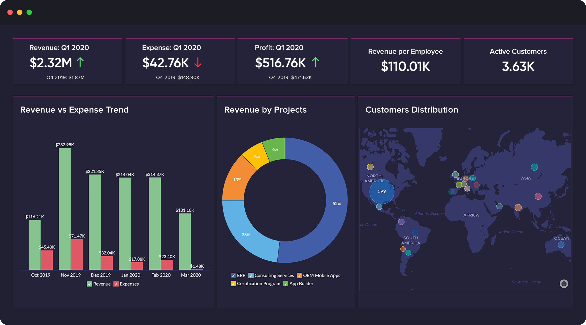
1. Bar Charts
Bar charts are used to compare the values of different categories or groups. They are effective for visualizing discrete data, such as sales by region or product category.
2. Line Charts
Line charts are ideal for showing trends over time. They are commonly used to represent data sets with continuous variables, such as stock prices, temperature variations, or website traffic.
3. Pie Charts
Pie charts are used to represent proportions and percentages. They are often used to show market share, customer segmentation, or budget allocation.
4. Scatter Plots
Scatter plots are used to visualize the relationship between two variables. They are effective in identifying correlations and outliers within a data set.
5. Heat Maps
Heat maps use the intensity or color of each cell to represent values across a two-dimensional table. They are useful for visualizing weather patterns, population distribution, or sales heatmaps.
6. Geographic Maps
Geographic maps are ideal for displaying location-based data. They allow businesses to analyze data at a regional, national, or global level and identify geographical trends and patterns.
Best Practices for Data Visualization
To ensure effective data visualization, it is important to follow certain best practices:
1. Clearly define the objective
Before creating any data visualization, clearly define what insights you want to derive and what story you want to tell. This will help in selecting the most appropriate visualization techniques.
2. Keep it simple
Avoid cluttering visualizations with unnecessary elements. Keep the design clean and simple to avoid confusion and ensure the focus remains on the data.
3. Choose the right visualization type
Select the visualization type that best represents the data and insights you want to convey. Each type has its strengths and weaknesses, so choose wisely.
4. Use appropriate colors and labeling
Colors and labels play a crucial role in data visualization. Use colors that are easy on the eyes and ensure proper labeling to avoid misinterpretations.
5. Provide interactive features
Allow users to interact with the visualization to explore and dig deeper into the data. This enhances user engagement and promotes a deeper understanding of the insights.
Conclusion
Data visualization is a powerful tool in today’s data-driven world. It enables businesses to gain valuable insights at a glance, make informed decisions, and communicate complex information effectively. By following best practices and leveraging various visualization techniques, organizations can unlock the full potential of their data to drive growth and innovation.